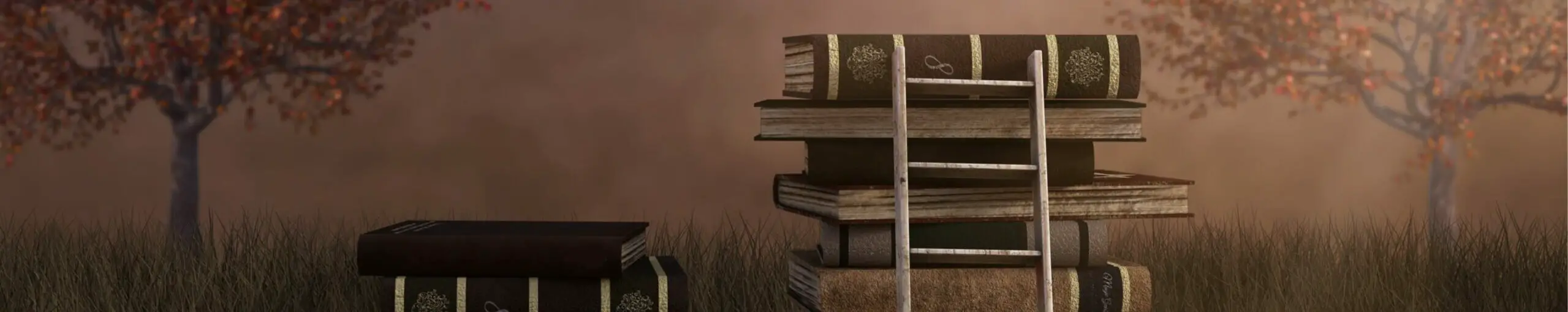
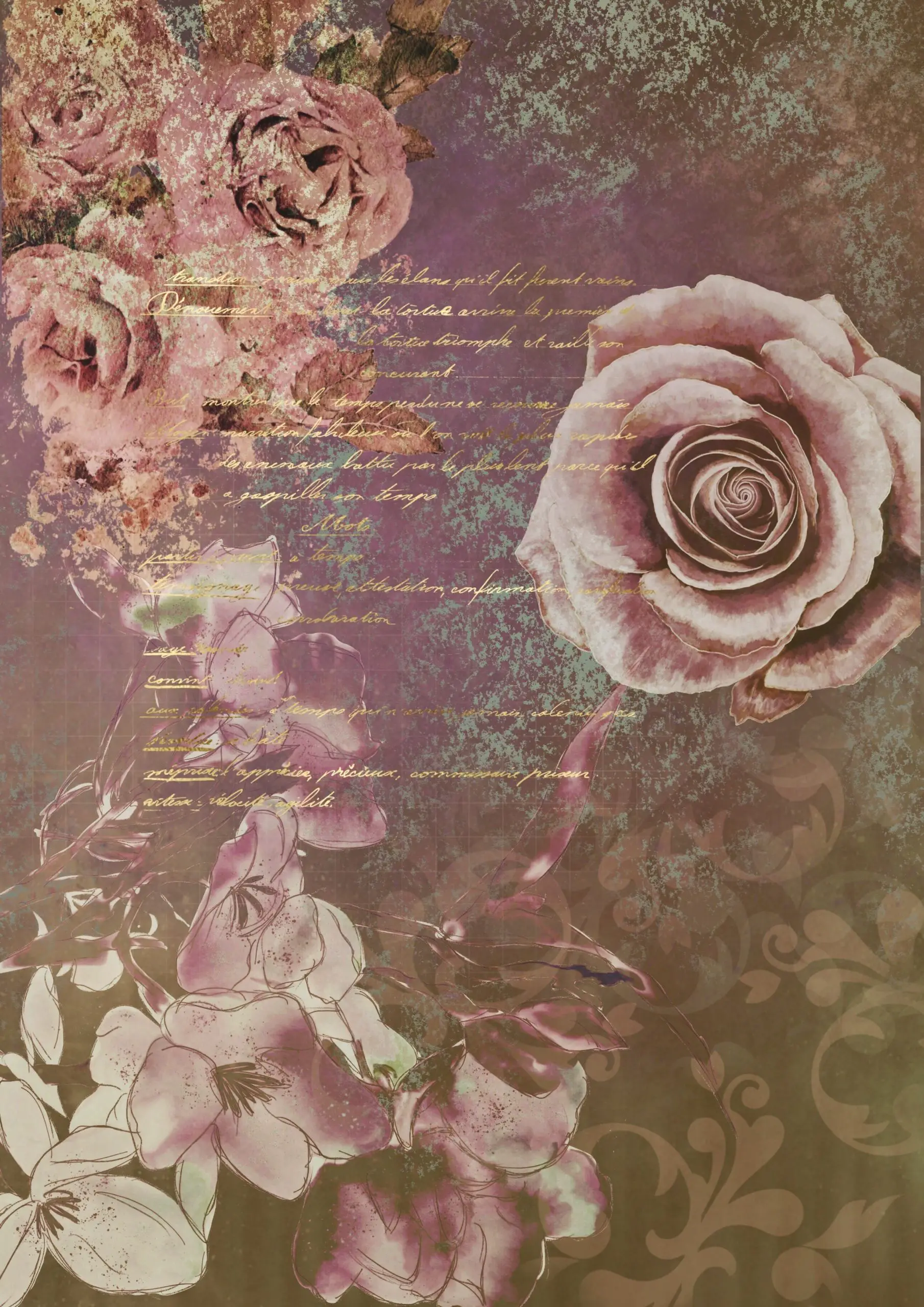
When creating art of all kinds, colour selection can be a challenge even to artists familiar with colour theory, but a strong choice of palette to go with is muted colours and earth tones.
While too often neglected in favour of monochrome or more saturated pallets, gentler, more muted colours like shades of sepia, light desaturated reds and greens, and even earthy shades of purple and blue, can evoke a sense of tone and emotion that is not as easily accessible through harsher, more vibrant tones. It’s important, however, for artists to know when and how to use muted tones, and what messaging they give to their audience by using them. Firstly, lets go over some of the shades and distinct features that make up a muted colour palette.
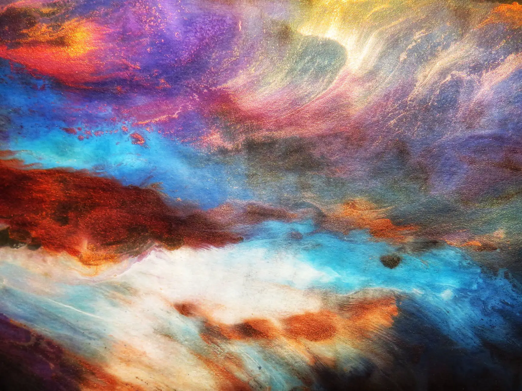
A muted colour palette, especially that of earth tones, is one that depends heavily on the use of subtlety and colour mixing. For both traditional and digital art forms, this means getting more comfortable with various techniques of colour theory and blending colours together on the canvas as they’re being applied, using multiple shades together to create a more subtle and nuanced effect.
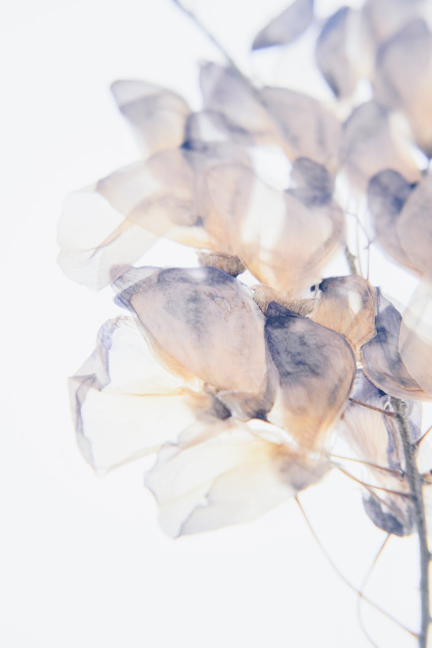
A good place to start is to look online for a few pre-selected muted or earth tone colour palettes, particularly those found in nature, which should give you a wide variety of examples of both desaturated colours that are complementary, or a collection of naturally-occurring shades.
One thing you’ll notice that both have in common is that both can, in fact, be quite bright, and aren’t boring to look at in the least. This is because, despite what their name might imply, natural and desaturated shades are just as different from each other, and just as vivid on the canvas as saturated ones are.

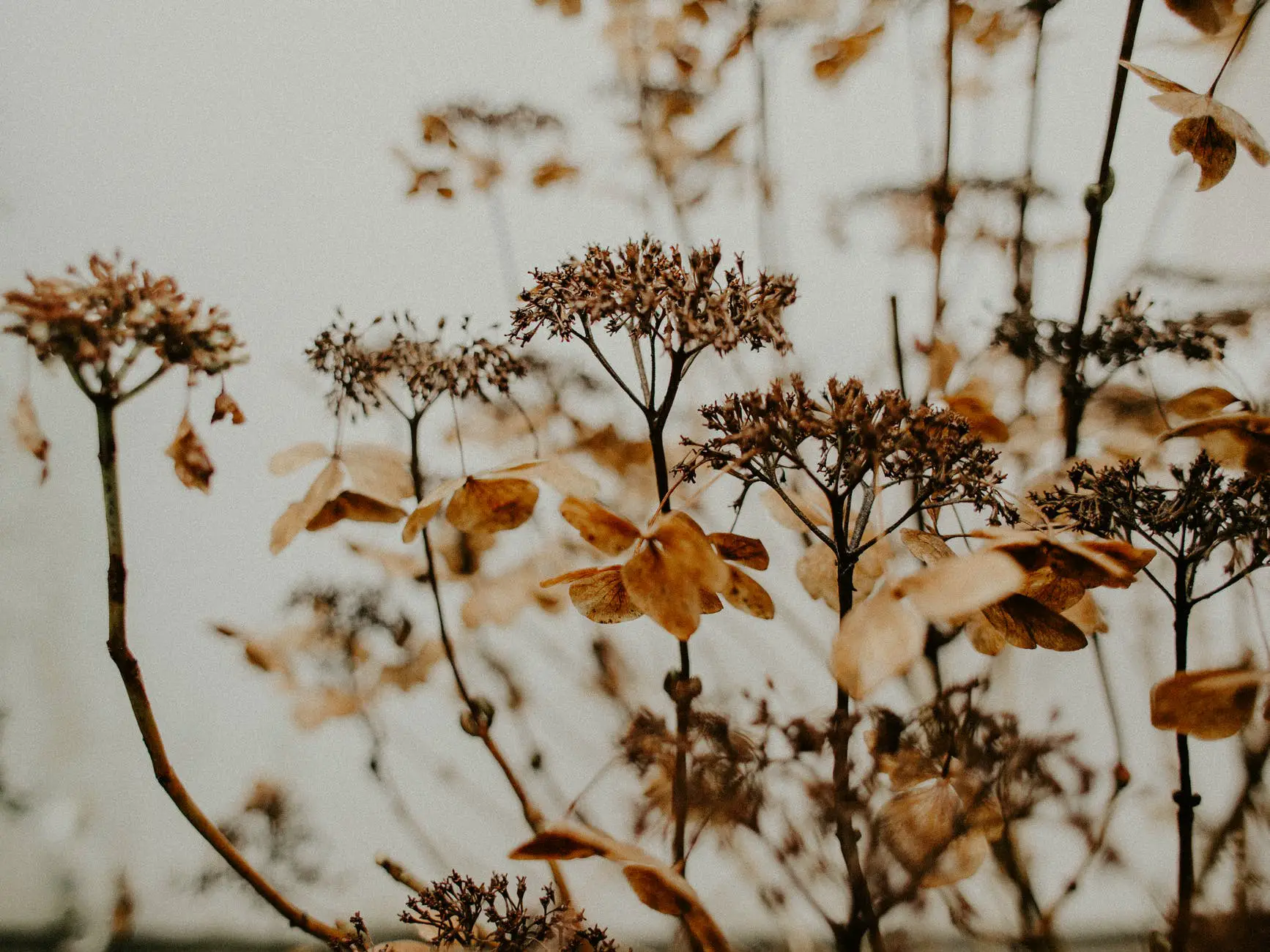
The red shades of leaves in autumn are all considered earth tones – as are the deep browns of the tree trunks they grow on, or the golds of a bird in the branches. These colours, when used in conjunction with each other, are nothing but drab, allowing the brighter, more saturated tones to pop more when they’re added to the canvas sparingly – if you were painting entirely with saturated tones, a goldfinch in the branches of a maple tree might disappear completely. With earth tones, however, small details like bright yellow feathering calls the viewer to look more closely, appreciating both the subtlety of the surrounding and the rare brightness within.
With that being the main summary of muted colours and earth tones, we can progress to some of the ways to use them, and for what purpose.
Muted colours come in a wider variety than earth tones, which encompass a much more narrow definition of shades, but both should be available for digital use very readily, and looking for them online should pull up readymade palettes for you to use in your own artwork, either free to use, or for a nominal fee.
With traditional art, however, it is easier to acquire these shades in a set, such as sets of watercolours or in as a set of markers, though it will be easier to find earth tones than muted colours in the case of both. While it is entirely possible to find muted markers and paints, learning how to blend colours to create muted, more gentle shades could be a more accessible skill, rather than scouring the internet for exactly the right shade every time. This skill is also transferable for other situations, so learning how to blend colours is beneficial overall.
One of the most basic rules of colour mixing is that you often want to begin with a lighter tone, and mix in darker pigments to get the desired effect, as it will take more light pigment to lighten a dark colour than dark colour to darken a light colour.
For example, if you want to create a dark, de-saturated green acrylic paint, you should start with a bright, light green, and add to it small amounts of grey and red to achieve a more natural, muted green.
This is not a hard and fast rule, of course, as you should start with the same green and lighten it with white and red in order to create a desaturated light green shade, but on the whole, you should not attempt to create a de-saturated green by beginning with black and adding green to it, though you can create a de-saturated green by starting with white and adding green to it.
Now, I’ve already hinted at another rule when it comes to colour mixing, but one of the keys to muting bright, saturated shades is to mix small amounts of that colour’s natural complementary colour.
That is to say, adding blue to orange, purple to yellow, or red to green, with shades in the middle following the same logic, such as adding violet to bright green. These, when used in conjunction with a small amount of any monochrome colour – white for lighter muted shades, grey for medium muted shades, and black for dark muted shades – are sure to mellow a shade out to be a more de-saturated and calm version of the original colour.
The effect that these shades have, and your reason for using them, is that muted shades tend to be easier to balance along with each other, creating a more balanced composition as a whole. If you have, for example, bright colours at the foreground, a background with a muted colour will make them feel all the more bright and visible, truly capturing the attention of your audience without overwhelming them, as is often the case with designs that use saturated colours only.
With both muted colours and natural earth tones, the effect can be used for more relaxed compositions that guide the viewer through them, with splashes of more saturated colours to act as the focal point, where the viewer’s eyes are naturally led to. You can even use earth tones exclusively for a piece, using them to better represent scenes with soft lighting and shading. Either way, adding muted colours and earth tones is an excellent way of lending depth and nuance to your artworks :).